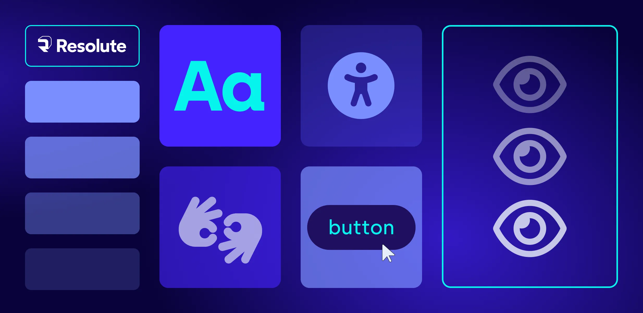
Design
Great UX without the bottlenecks: Resolute's on-demand UX/UI subscription service

Like anything else, the web is not spared from changes in attitudes and fashions. From generational shifts in preferences to new technological capabilities, websites must adapt in order to remain attention grabbers. Attracting new users and retaining them is possibly both the biggest challenge as well as the biggest goal for marketers.

It’s a shame when we succeed to attract the right customer to our website, only to have them bounce within 10 seconds. Unfortunately, there are plenty of ways in which we can drive visitors away from our website and lose conversions.
In this, and in a follow-up blog post on the topic, we have asked our expert Maria Kovacheva, Director of UX/UI at Resolute Software, to share her experience with us.
Here, according to Maria, are the 3 most common reasons why target personas leave a website. In the next blog post, Maria will also share a few ideas on how to make them stay.
Let’s find out what they are!
First things first. According to the “15-second rule”, if your website has failed to generate interest and excite visitors within roughly 15 seconds, they will leave. This is a very short amount of time for them to have deeply vetted the quality of your website’s content. It’s more of a snap decision, based largely on their first impression. This is where UX really counts.
So what are the reasons, specifically, for people leaving on the basis of their first impression?
A tale as old as time says that we consume with our eyes, and it doesn’t only apply to wine (Inc.). Visual stimuli greatly influence our perception of taste, smell, and flavor. The same goes for buying something - in order for site visitors to be captivated by the website, you need to provide them with visuals that engage them. Central elements here include:
This aspect of your website is within the domain of an experienced UI designer and their understanding of how all of the above fits and interacts together.
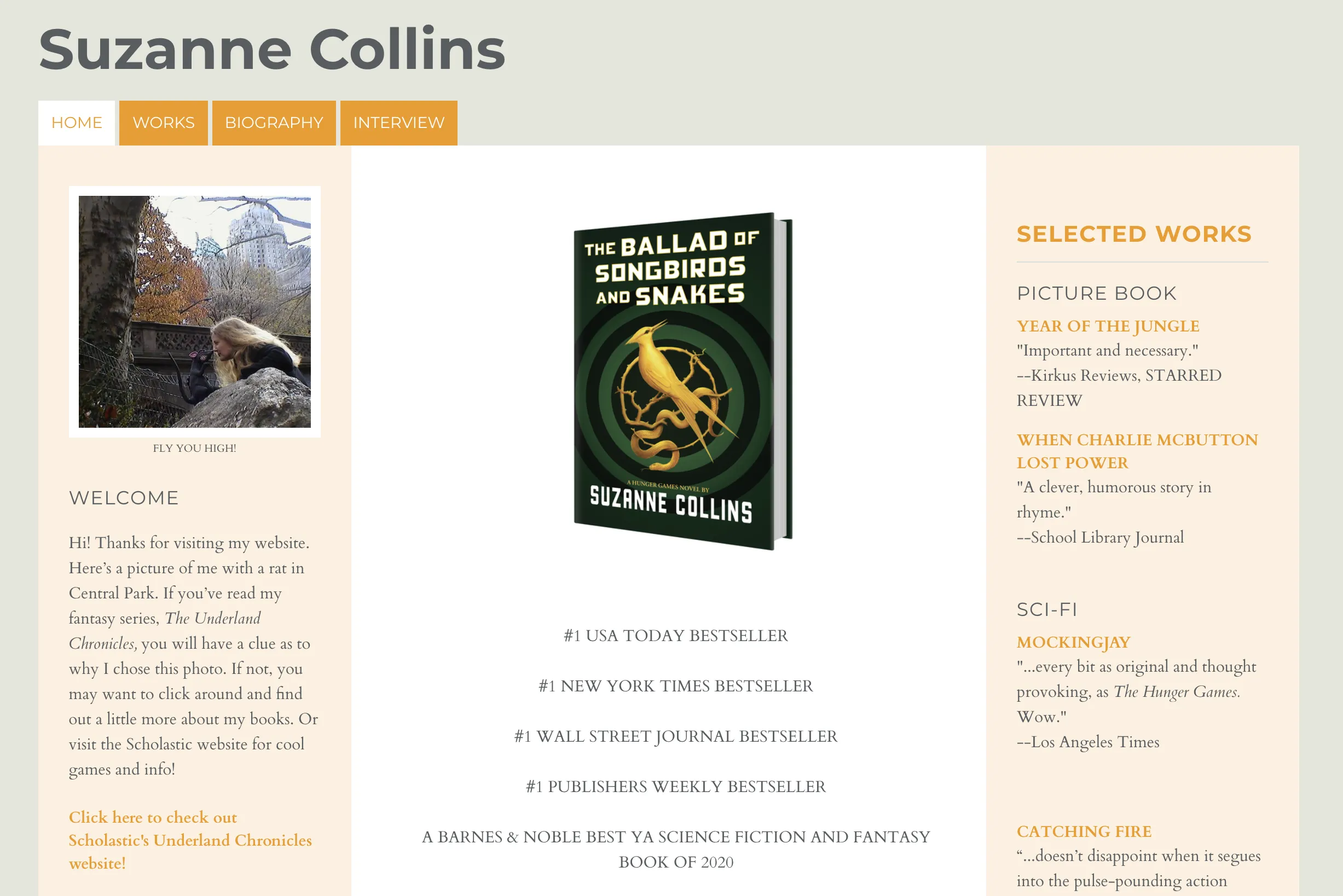
Let’s look at the following example of Suzanne Collins website - a famous US writer who wrote the Hunger games. Despite her being a celebrity in her field, her website is not that inspiring. It is more than obvious that the color scheme, shapes, fonts and typography are missing coherence between each other. The worst thing in this example is that the CTA on her welcome page invites users to leave her website and redirects them somewhere else.
Paradoxical as it may sound, you can’t reveal it all on the first screen and above the fold. That would make the rest of your website irrelevant. Unless you can sum up your business, your solutions, and value propositions in one screen, it’s best not to reveal all of your cards immediately.
What you want to do instead is to create enough excitement through gamification, interactivity, and the interplay of all website elements to lead visitors toward your desired goals. This will help retain visitors longer on your website, at which point you will have an increased chance of also winning them over with your value propositions.
For this aspect of your website, in turn, an experienced UX designer is required - someone who knows how to build a solid and interactive experience that can keep people’s attention.
One way to define intuitive design is the coherence between the different elements of your website so that visitors naturally gravitate to the most important elements and interact with them. Intuitive design encompasses both the hierarchy of elements and navigability of your website as well as the quality of the story that strings the elements together and keeps visitors’ attention focused.
To be intuitive, UX needs to be behavioral. Apart from understanding the “mechanics” of design, UX designers also need to be good psychologists. They need to be able to empathize with users in how they perceive and relate to a website and what pulls them in the direction of a particular action. All of this is included in the sequence and combination of colors, buttons, content, calls to action, images, etc.
Apart from the initial impression made by your UX, the second most significant factor is content. If your content is too difficult to understand, or if it is irrelevant, your visitors will likely not be patient enough to find out more. Here are the different aspects of your content that may cause people to leave.
If your audience does not see itself represented and mirrored in your content, they will not be able to connect to your message. To present your product in a way that is thrilling and exciting, you need to speak your customer’s language. This requires you to have a good grasp of their needs and wants, their pain points, and what is likely to impress them.
So, to avoid being irrelevant, study your audience carefully and define detailed target personas and what value you can offer to each of them with your products. From there you can also proceed with defining their journey from start to finish.
When it comes to buyer personas and their journey, your marketing team can help you with defining them accurately.
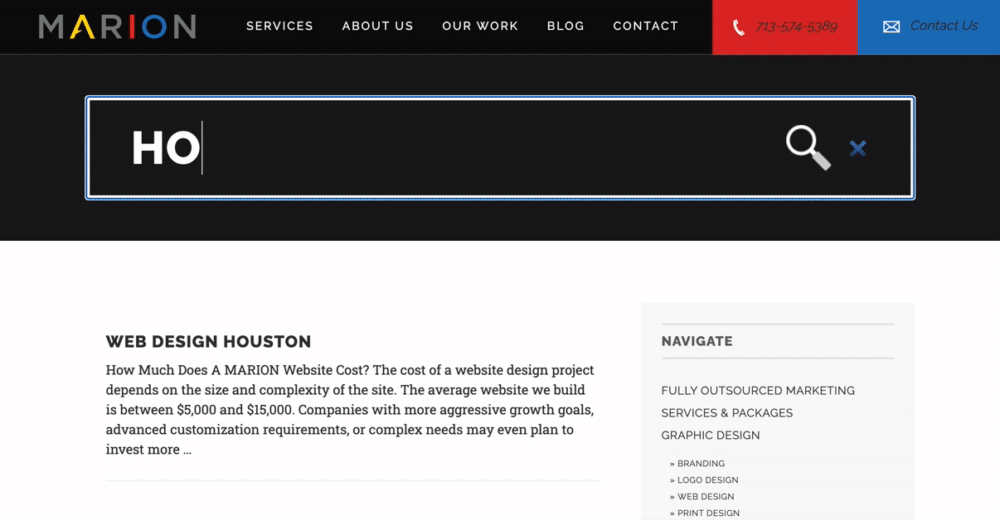
The following example shows a website that offers design and marketing solutions, with a huge search bar on the top that should probably facilitate users’ journey or simply excite them. Instead, it occupies one-third of the screen and is the only thing you can see when opening the website. Besides, it’s not optimized well as the text written in the search bar overlaps the search icon.
By Marion
The formatting of your content is another major reason why visitors bounce from your website. Big blocks of text, heavy sentences, too little white space - all of these make your content hard to read and discourage visitors from spending more time with you.
Performance issues are the third major category of reasons why users leave a website, sometimes before they’ve even arrived. Major performance issues that will increase your bounce rate include the following:
There are roughly 4.3 billion active mobile internet users globally, and mobile internet traffic accounts for about 55% of total global online traffic. For years now, Google has favored those websites that are at least mobile-friendly, if not responsive - to the extent that you’re likely not to show up in organic search results if your website isn’t optimized.
For the purpose of capturing all of this mobile traffic, you need to make sure that your website is responsive and can adapt to the preferred devices and systems of different users. Without this feature, you are sure to lose a majority of those users that try to access your website through mobile, only to find that they need to zoom in and out in order to navigate it.
Long loading times are equal to lost opportunities. Once your website takes longer than three seconds to load, you can expect an increasingly larger number of visitors to give up on it. This may sound like an exaggeration but it has been studied repeatedly, and the results are clear - if your website has performance issues, it will be abandoned.
The next example is a website about professional eyelash extension courses. When testing the speed for download of the website we get 300Mbps, but obviously, the background image is very hard to see because of speed issues.

Here you may want to consider modernizing your website in order to increase its load speed and performance. Conducting a UX assessment is one way in which you can determine where your website is underperforming and how you can improve it.
Readability is a matter of choosing the right typography, size of the font, and line spacing. This is necessary in order to reduce eye strain. Sometimes something as simple as increasing font size or spacing can have an immediate impact on your engagement and conversions.
Based on the above, do you spot any issues with how your website is performing currently? Do you have clearly defined personas and is your website intuitive to navigate? Or are you experiencing high bounce rates and frequently miss good opportunities?
If you think your website might need a check-up, get in touch with us, and let’s see how Resolute can help you improve your website’s performance and increase both the frequency and length of website visitors’ stay.
Meanwhile, stay put for the second part of this blog post in which Maria has offered 3 essential tips on how to make visitors to your website stay for longer.