All Articles
Design

Scaling web accessibility: Inclusive learning by design

How Resolute built an accessible and scalable learning platform through design systems and thoughtful front-end development.

Leman Pehlivanova
29 Oct 2025
12 min read
Leman Pehlivanova
29 Oct 2025
12 min read
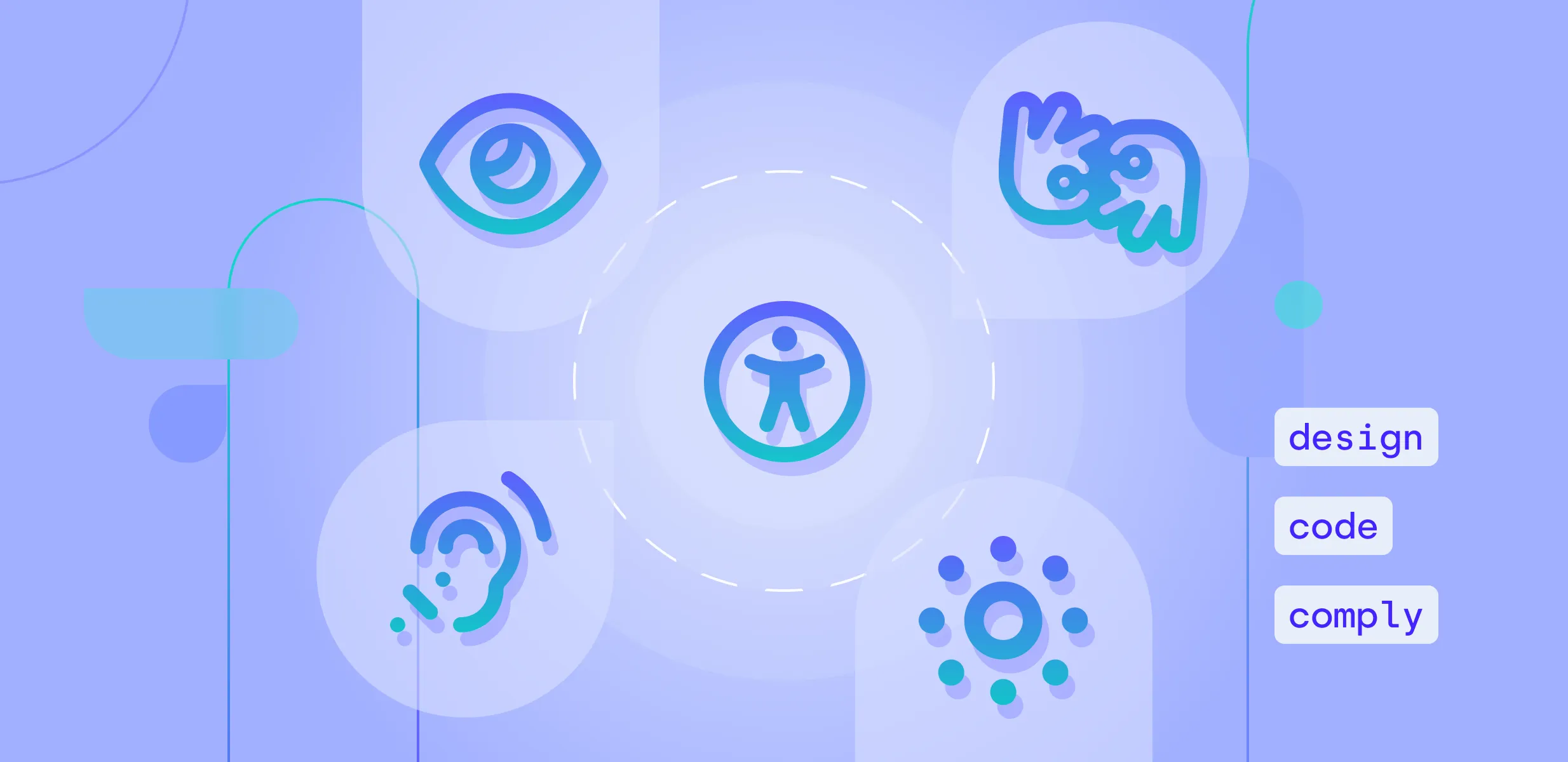
Web accessibility must be integral to every digital experience, especially in workforce learning. Designing for inclusivity is essential, not optional. Just as a chair requires stability for all, online platforms must serve every user from the start.

But when the platform in question is educational, the stakes are even higher. These platforms serve a diverse range of learners - some with visual, auditory, motor, or cognitive impairments - and face stricter accessibility requirements than general websites. That’s why Resolute was proud to partner with a U.S.-based company providing online training tools for frontline employees. The goal: build a more functional, accessible, and scalable web experience.

When design slows you down

The project started with a familiar pain point: fragmentation. The client’s design ecosystem was spread across multiple sources:
  • An internal Figma library shaped by years of brand tweaks
  • A partially customized theme inside Telerik ThemeBuilder
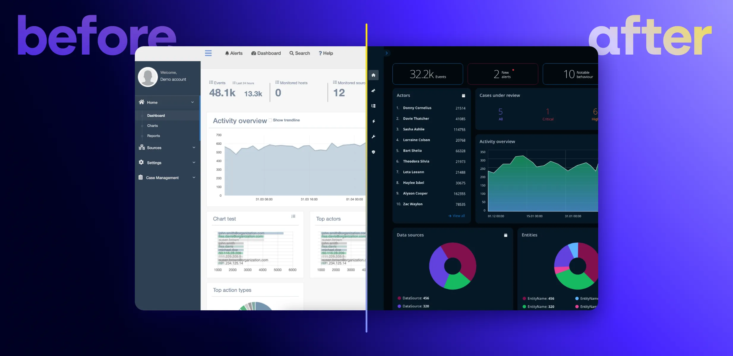
  • A live site with Kendo UI components that didn’t always align with the designs
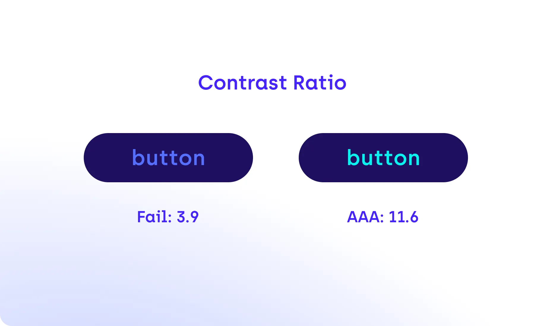
This led to confusion, delays, and inconsistencies, especially around accessibility. Developers struggled to map designs to actual components. Theming was brittle. And certain UI patterns weren’t usable for people relying on keyboard navigation or assistive technologies.
Resolute was brought in to clean it up, streamline the workflow, and help the client move toward a more compliant and scalable solution.

Fixing the foundation: ThemeBuilder in action

Our UX/UI team began by auditing the client’s existing design system. They worked closely with their internal team to unify the visual language and migrate it into Telerik ThemeBuilder, which served as the central source of truth for styling and theming moving forward.
ThemeBuilder wasn’t just a convenience; it enforced consistency in design tokens like colors, borders, and spacing, while also aligning with accessibility best practices.
UX/UI team’s work included:
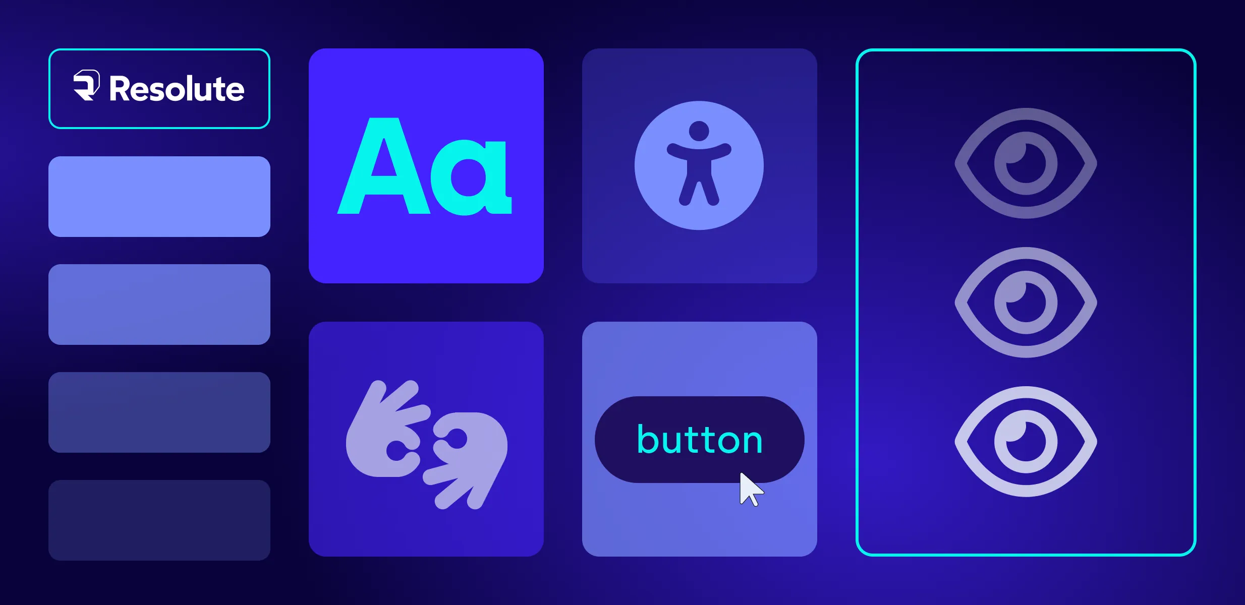
  • Consolidating redundant button and form variations
  • Fixing visual issues with contrast, spacing, and typography
  • Helping the design team understand how to use ThemeBuilder effectively to support long-term accessibility

From visuals to code: accessibility in the build

Once the design foundation was solid, our front-end team began implementing the new UI in code. Over several months, the platform’s front end was rebuilt with accessibility as a core requirement, focusing not just on how it looked, but how it worked for every user.
This wasn’t just about good UX; it was also about meeting real compliance needs. Since the platform serves a broad user base in the U.S., including educational and government-affiliated organizations, several legal standards apply, including:
  • ADA (Americans with Disabilities Act): Particularly Title III, which applies to educational institutions and commercial websites
  • Section 508 of the Rehabilitation Act: For platforms receiving federal funding or working with government entities
To meet these requirements, we aligned the build with WCAG 2.1 Level AA guidelines developed by the W3C (World Wide Web Consortium), currently the most widely used benchmark for web accessibility in the U.S.
As accessibility standards evolve globally, keeping up with new legal frameworks and technical updates has become as critical as meeting today’s compliance checklists.

Global standards snapshot: Why “AA” is a moving target

Accessibility expectations continue to evolve. In the United States, the Revised Section 508 Standards still reference WCAG 2.0 Level AA as the legal baseline for most public-sector projects. However, many organizations now target WCAG 2.1 or WCAG 2.2 AA compliance to address more recent success criteria. These relate to low vision, cognitive accessibility, and mobile or touch interactions. This approach helps ensure that modern digital products remain usable and compliant as standards evolve.


WCAG 2.2 was released in late 2023 and introduced nine new success criteria, including Focus Appearance, Target Size (Minimum), and Accessible Authentication. These updates are especially relevant for interactive web applications and online learning platforms, where users engage with complex interfaces and controls.


In Europe, the European Accessibility Act (EAA) entered into force on 28 June 2025. It extends accessibility obligations to a wide range of digital products and services. These include e-learning tools and software platforms. The EAA references EN 301 549, a European standard that incorporates WCAG 2.1 and adds further technical requirements for software, electronic documents, and ICT products.


Organizations that operate globally or serve EU-based learners can benefit from aligning their accessibility strategies with WCAG 2.1 or 2.2. They can also map these to EN 301 549. This alignment not only ensures consistency and legal compliance but also reduces remediation costs as standards continue to advance.

What that looked like in code:

  • Every interactive element was accessible via keyboard navigation (tab, arrows, etc.)
  • Clear, visible focus states were implemented for all buttons, links, and forms.
  • We structured the app using semantic HTML and applied ARIA roles for assistive tech (e.g., <button>, <nav>, <form>). Yet, we applied ARIA roles only when necessary for custom components or non-semantic elements, avoiding over-reliance on ARIA. It’s crucial to use ARIA only when native HTML elements can't provide the required functionality.
  • For use cases beyond the default configurations of Kendo UI or ThemeBuilder, we wrote custom HTML overrides.
  • Duplicate labels or screen reader confusion were avoided using attributes like aria-hidden="true" where needed.
Testing was both automated and manual. Tools like axe DevTools, WAVE, and ChromeVox helped flag contrast issues, label duplication, and navigation traps. But human testing mattered just as much. Therefore, a touchscreen laptop was used to simulate real user scenarios, check responsiveness, and validate how elements behaved across screen sizes and input types.  

When “out of the box” needs a little help

Telerik ThemeBuilder and Kendo UI offer strong accessibility features, but when components are heavily customized, unexpected issues can appear. Resolute helped the client troubleshoot several edge cases:
  • Buttons built without the base component didn’t render properly
  • Some forms displayed labels twice to screen readers (e.g., “Username Username”)
  • Blazor components lacked alt-text bindings, requiring a workaround
None of these problems was a dealbreaker, but they showed how expertise matters. Without front-end developers who understand both the framework and accessibility requirements, these issues could have gone unnoticed.

When we started testing custom buttons, we realized some overrides had removed their built-in focus indicators. It’s a small detail, but it affects every customer who needs accessibility and keyboard support. My rule now is simple: if you customize a component, always test the change within the customer's full environment before touching anything else,” shares Dimitrina Sirakova, 
Senior Front-End Developer at Resolute. 
Each project like this one reinforces valuable lessons about how accessibility, scalability, and teamwork intersect in real-world development.  

Lessons learned: Building accessibility that lasts.

  1. Accessibility starts in design, not in QA.

  2. Fixing accessibility late in development is always more expensive and less effective. Embedding it in design systems and component libraries ensures compliance and usability scale together.

  3. Consistency is the foundation of accessibility.

  4. By unifying colors, typography, and UI patterns inside ThemeBuilder, we reduced design drift and minimized accessibility regressions across releases.

  5. Customization needs caution.

  6. Extending frameworks like Kendo UI can enable flexibility, but every override should be tested for semantic and keyboard behavior. A small deviation can undo much of the built-in accessibility.
  7. Human testing still matters.

  8. Automated tools catch a fraction of real issues. Manual checks by designers and QA testers using assistive tech (such as screen readers and keyboards) catch the nuances that automation misses.

  9. Accessibility is a shared language.

  10. The most successful outcomes come when UX designers, developers, and compliance officers speak the same language and document their accessibility decisions together.

Accessibility = Structure + Semantics + SEO

There’s another benefit to building with accessibility in mind: better search engine optimization (SEO). Many of the same practices that support users with disabilities, like using semantic HTML, a well-structured HTML DOM (Document Object Model), and meaningful headings, also help search engines understand and rank your content.
The front-end implementation included:
  • One <h1> per page, with clean heading hierarchies for structure like <h2> for sections and <h3> inside components
  • Alt-text for all meaningful images
  • Descriptive link text and accessible navigation
The result? A platform that’s easier to use, more discoverable, and legally compliant.

Knowledge transfer matters

Resolute’s role expanded beyond design and development work. We trained the client’s internal team to maintain and build on the system with accessibility in mind. That included:
  • Documenting all accessibility decisions and techniques used
  • Providing reusable design patterns in ThemeBuilder
  • Running training sessions on WCAG basics and development workflow tips
Accessibility isn’t something you do once. It’s a practice. So, we made sure the team could carry that forward.

Final thoughts

Accessibility is a shared responsibility - across design, development, and leadership. Our client understood that, and with the right tools and support, made serious progress toward a platform that works for everyone.

Progress Telerik ThemeBuilder helped streamline and standardize the design-to-code process. Resolute helped connect the dots by aligning compliance, usability, and long-term scalability.

Looking to improve your product’s user experience?

If your platform feels held back by usability issues, design inconsistencies, or user friction, Resolute’s UX Assessment is a structured way to get clarity and a plan. It goes beyond visual design critique. The goal is to identify why users encounter friction and how product teams can resolve it effectively.

Who it’s for

The UX Assessment is designed for:
  • Product teams that need a clear usability diagnosis before investing in redesign or replatforming.
  • Enterprises with legacy systems seeking alignment with modern UX and accessibility standards such as WCAG and Section 508.
  • Scale-ups and SaaS companies looking to improve retention and reduce support costs through better UX.
  • Healthcare, education, and compliance-driven organizations where clarity, inclusivity, and legal adherence are critical.

How it works

The process is concise yet comprehensive:
  • Define goals and scope during an initial discovery session.
  • Conduct qualitative and quantitative user research.
  • Analyze patterns and prioritize issues by user impact and business risk.
  • Present actionable recommendations and design insights.

What you can expect

A detailed usability report outlining key findings, accessibility scores, and prioritized solutions, accompanied by practical recommendations your team can immediately implement or use as a roadmap for future enhancements.
Whether you’re planning a redesign or simply want to make smarter product decisions, the UX Assessment is a practical first step.
Web Accessibility
Digital Accessibility
Design Systems

stay tuned

Subscribe to our insights

Secured with ReCAPTCHA. Privacy Policy and Terms of Service.